Hello again, fellow homedogs and book lovers alike!
Today, I want to have a chat about aesthetic. Specifically, Instagram aesthetics. Even more specifically, Bookstragram aesthetics on Instagram.
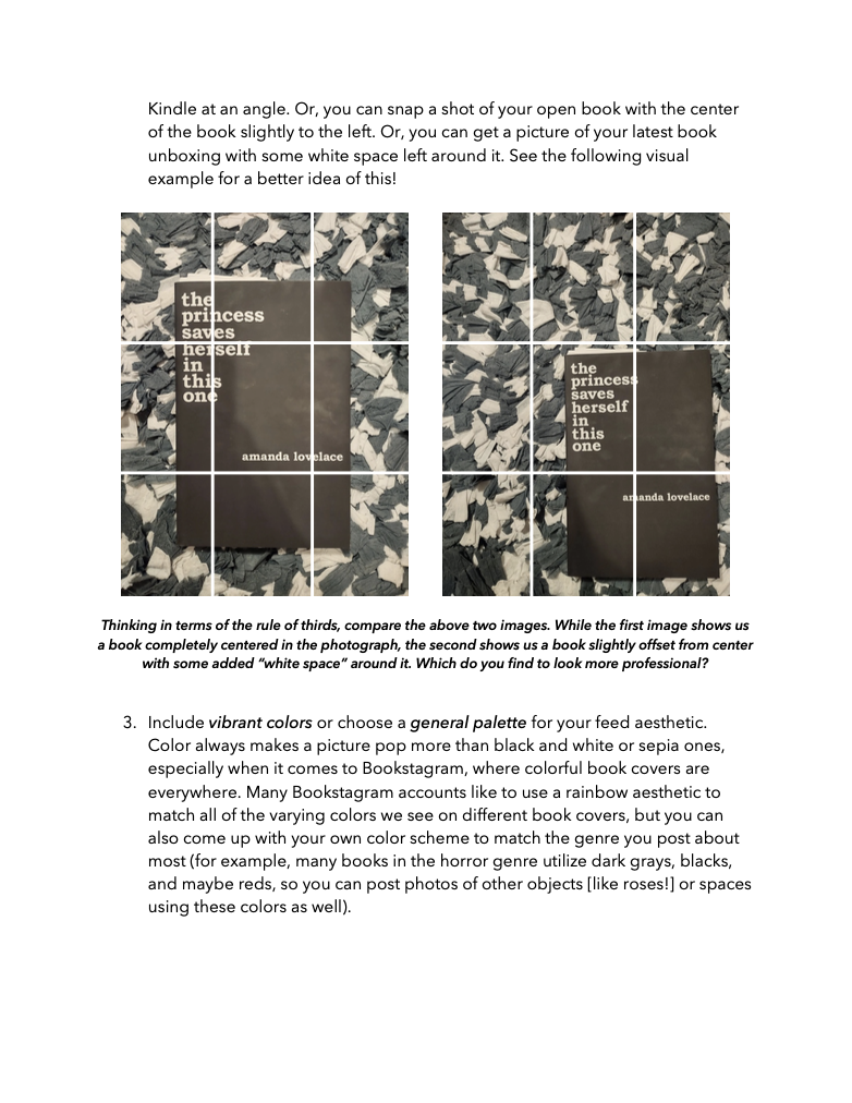
So, whether you’ve been around on Insta for a while, or you’re completely new to the platform… well, I got you! Because we’re going to go over what an “aesthetic” actually is (although, frankly, the definition can vary according to who you ask… but, again, I got you, and we’ll figure it out together!), and then we’re going to see whether or not we actually need to have one on our book-themed Instagram pages, A.K.A. our Bookstagram accounts.
So, First, Let’s Define “Aesthetic”
Personally, I think everyone can just about agree on the thought that the term aesthetic has to do with visually-pleasing things. If you don’t trust me on that, though, then here’s a quick definition from our most official dictionary on Earth… the one sitting on the top page of a Google search for “what is aesthetic.”
aes·thet·ic
/esˈTHedik/
adjective
concerned with beauty or the appreciation of beauty.
Thanks for that, Oxford Languages, provided by Google!
So, essentially, “aesthetic” has to do with the “beauty” of something. However… I think it’s important that we also remember that beauty itself has a different definition according to whomever you ask, and what is considered “beautiful” or “pretty” to one person may not be to another. So, the same goes for aesthetics.
Now, specifically in terms of Instagram, aesthetic usually has something to do with the “vibe” of a person’s profile. And, again, this means that one person’s “vibe” is going to differ from someone else’s, and the beauty of each vibe is in the eye of the beholder… and all that.
I also like to tell people that color plays a huge role in your “aesthetic” on Instagram, whether you’re on the Bookstagram side of the platform or not. I mean, if you take virtually any visual design class ever, whether it’s on fashion or interior design, I can guarantee that the topic of color is going to be covered quite heavily. (And, yes, I also know this from experience–so trust me on that one, too!)
I also explain the use of color in my free Guide to Bookstagram and BookTok, which you can totally get a copy of anytime, anywhere (again–it is totally FREE, and there’s no strings attached–I just wanted to create a great resource for my fellow readers to use!)

Some Visual Examples of Bookstagram Aesthetics
Now, to help me create this post here for you all, I asked some of my own friends over on Instagram for their thoughts on Bookstagram aesthetics. Plus, they were willing to let me share some snapshots of their own aesthetics for you so that you have some examples of “aesthetic” and what it means to fellow Instagrammers!
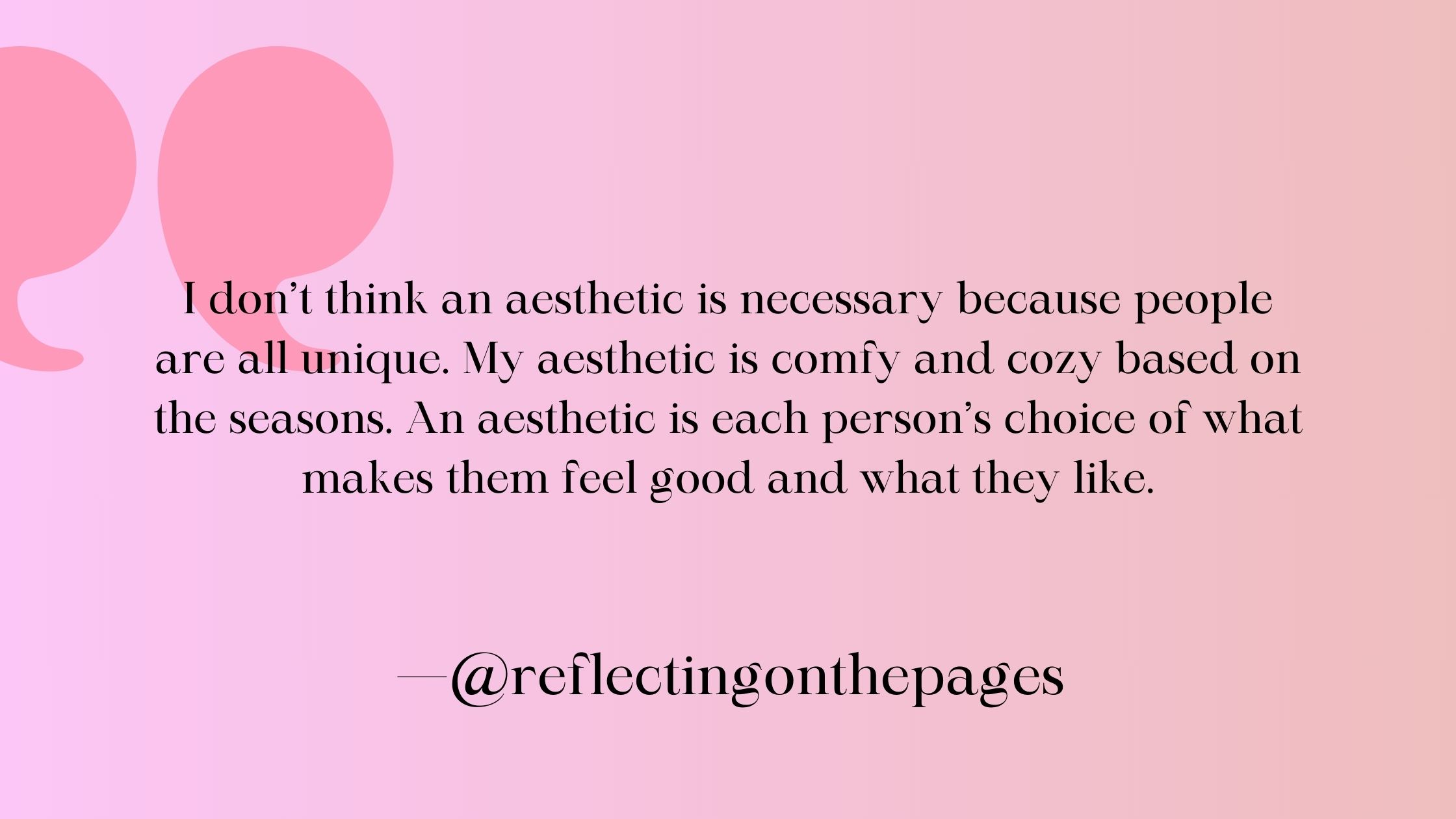

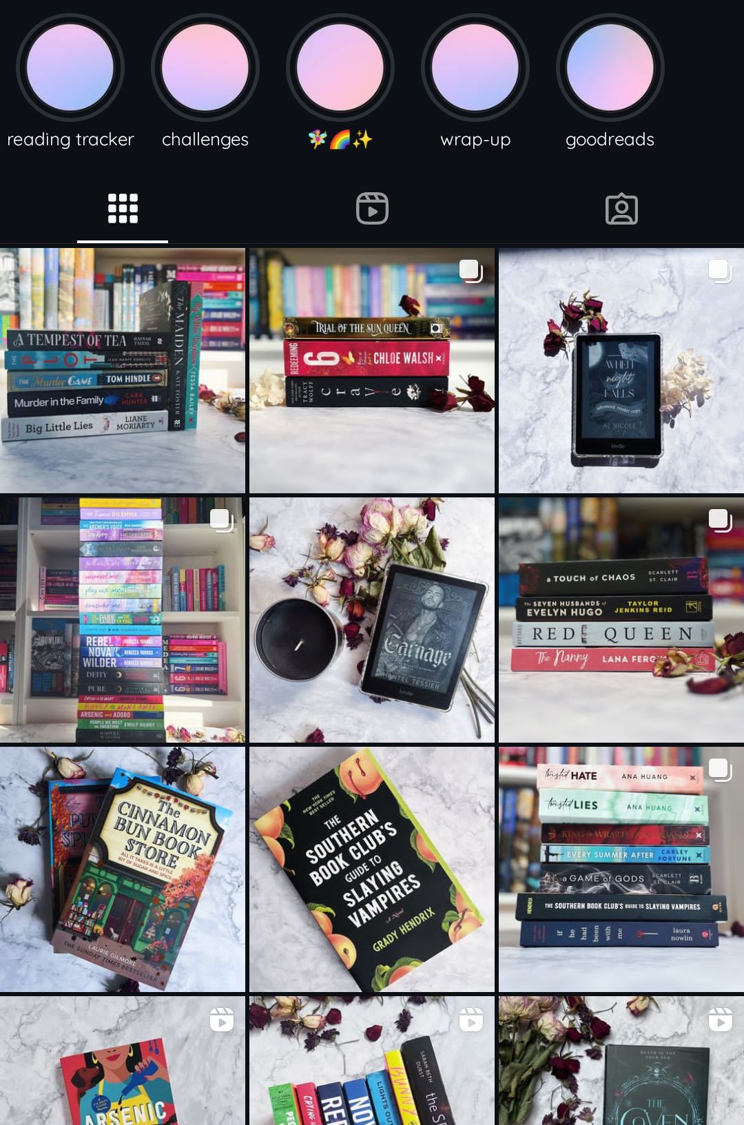
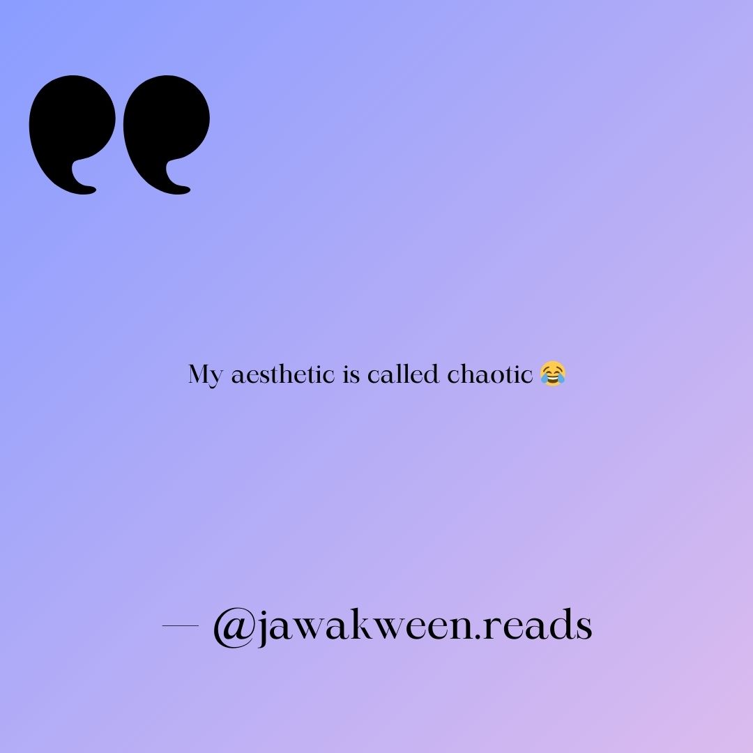


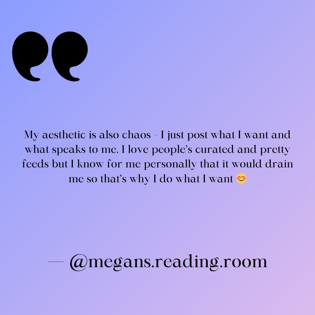
Visit the Bookstagrammers here:
Now, Do You Need an Aesthetic on Bookstagram?
Just as our fellow Instagrammers pointed out above, it’s never absolutely necessary to have a Bookstagram aesthetic. You are free to do whatever you want with your social profiles–and that freedom is a big part of what makes Bookstagram so beautiful in and of itself!
Honestly, I think it’s important to remind you that most people are going to see your Instagram posts in their feed, that is, on their home pages, among all of the other posts by all of the other people they follow. And, really, an aesthetic only applies to your profile as a whole–not each of your individual posts, if that makes sense.
Essentially, I’d say about 90% or more of your Instagram followers will just see your posts in their personal feeds, and only 10% or less will regularly look at your profile page to see your aesthetic. This is why I personally believe that aiming for a certain aesthetic is not necessary, unless you really want to make your profile experience powerful for that 10%. Otherwise, you can post anything you want, and you shouldn’t worry about affecting your profile’s appearance… because most of your followers aren’t going to regularly check your profile page!
However, it’s also important to note that Instagram is a platform built around visual experiences, so it never hurts to work toward a certain aesthetic–so long as you don’t stress yourself out over sticking to that aesthetic.
Again, I outline a top of aesthetic tips in that free Bookstagram and BookTok Guide, which I highly encourage you to check out!


One of the top tips I have for those who want to stick to a certain aesthetic, though, comes back to the use of color. Pick one or two colors that you personally like, and incorporate those into a lot (doesn’t have to be all) of your Instagram posts.
Now, I really hope this post helps you build, or even decide if you need, an Instagram aesthetic. If it does, feel free to leave a comment below, or let me know if you have any other questions on this topic in either a comment or by contacting me.
Until next time, be sure to check out all of the lovely Bookstagrammers mentioned in this post–they’re all extremely friendly and would also love to chat with you on Insta!
–Kari

