
Simply put… well, there’s nothing really simple about color theory. However, that doesn’t mean it has to be confusing, especially since we need to use it, basically, every time we sit down as artists to paint a canvas!
And, while there are probably a hundred different definitions of “color theory”, I’ll just share mine. Which goes something like this…
Color theory is the “theory” of how colors work—how we, as artists, can manipulate and shape them both on and off the canvas. It helps us mix and use colors of paint to get the desired color we want every time we sit down to paint a picture.
Now, is that confusing in itself? Maybe. But, guys… just roll with me on this!
Want to take a full, in-depth Color Theory Class? Join now and get access to the video plus a printable Color Theory Workbook!
Understanding What “Theory” Is
First and foremost, it’s important to know that color theory is a theory—it’s a science. And, just like any other scientific theory (think “theory of relativity”, if you’d like, Einsteins!), it can be an ever-changing system of thought. Meaning, in simpler terms, it’s not a perfect, set-in-stone law.
As a theory, color theory isn’t perfect, and the “rules” of color theory can be messy—just like art itself, right?
For example, while some “rules” of color theory may apply to one tube of paint color… well, the same “rules” may not work for another tube of another paint color. However, there are some good “rules of thumb” that we can use to implement color theory into our paintings—and they aren’t always this complicated.
So, again, keep rolling with me on this!
The Common “Rules” of Color Theory
Now, when we use color theory, we can refer to some commonly tried-and-true “rules” that will help us when we go to mix and use colors of paint. Note that color theory can also be used to make colors in other contexts (for example, in pixels on a computer monitor), but we’re just going to focus on the context of painting for today.
Hallelujah for some sense of simplicity here, right?

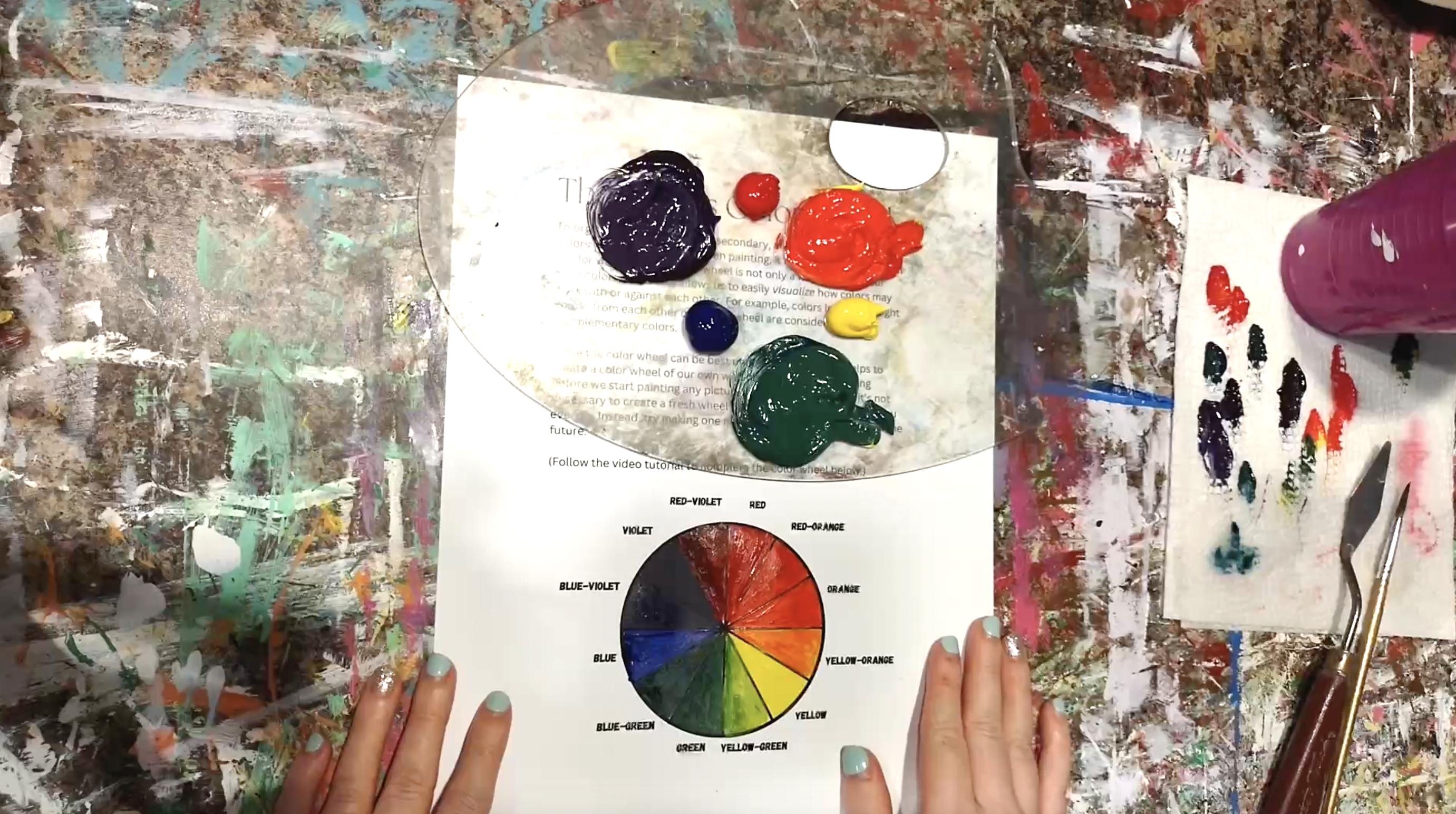
The “Rules” of the Color Wheel
Chances are, you’ve seen or at least heard of a color wheel before. And, believe it or not, this wheel is central to making color theory work!
A color wheel is a visualization tool that shows us how colors can be “organized”. Typically, we organize colors in a circle, and they “circle” around from warm to cool, then back to warm again.
Within the art realm of color theory, we have 3 primary colors, too. And, when we go to make or look at a color wheel, we’ll see those three colors places in a “Y” shape on the wheel, all equally spaced apart. And those colors are red, blue, and yellow (and, luckily, the order they’re placed in doesn’t matter!).
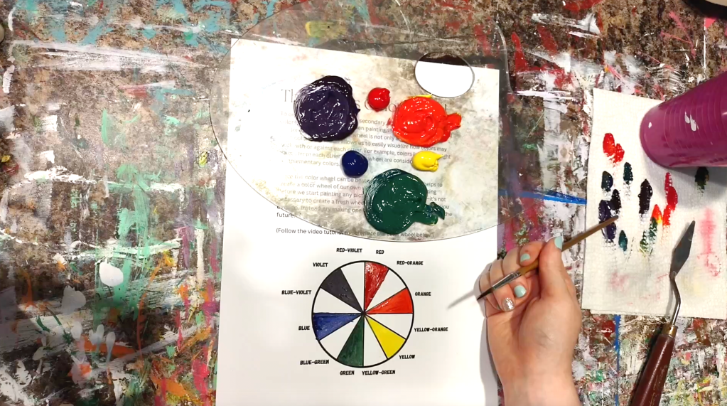
In between each of our primary colors, we’ll see our secondary colors. And secondary colors are those that are created by mixing each of our primary colors together in sets of two—by mixing together red and blue, blue and yellow, and yellow and red. These create violet, green, and orange.
In between all of our primary and secondary colors, we can also mix intermediate or tertiary colors. These are made by mixing each primary color with a neighboring secondary color, getting us tones like yellow-orange and blue-green.
Once we have a full color wheel at our fingertips, we can look into the other “rules” of color theory more easily.
The “Rules” of Tints and Shades
With any color we find on our color wheels, we can actually make that color lighter or darker. And those lighter versions of any color are called tints, and those darker versions are called shades.
Depending on the type of paint you use, there are a couple of different ways to make tints and shades of any given color. Most commonly, though, you’ll want to add a “lightener” to make a tint of a color and add a “darkener” to make a shade.

A “lightener” is typically white paint, although you can also sometimes add a clear liquid (AKA water). A “darkener” can be many more things, though, such as black paint, a version of umber paint, or even a given color’s complementary color.

Again, this can be confusing, but it doesn’t have to be, so I highly recommend checking out this Color Theory Class to get a more thorough explanation of everything!
The “Rules” of Complimentary Colors
Well, you may have heard of complementary colors before, but do you know what they actually are?
If you think so, here’s a chance to quiz yourself: give me the complement of primary red. Tick, tick, tick… (I’ll share the answer at the end of this section, so you’ve got more time to think, if you need!)
Now, complementary colors are the “opposites” of colors in the color theory world. And, while there are technically different types of complementary colors (such as split complementary colors), we’ll just focus on regular complementary colors. And regular complementary colors are simply those that sit exactly opposite one another on the color wheel.
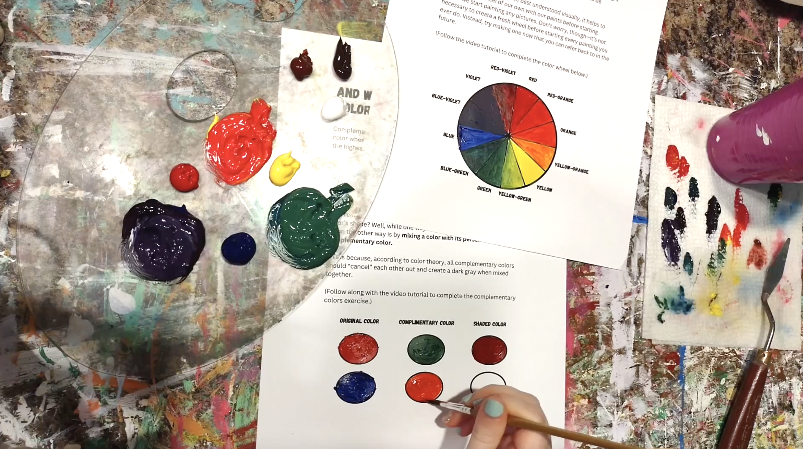
You don’t actually have to know and use complementary colors in every painting you ever create (I sure don’t!), but they are very useful to know if you want to play around with things like composition (which is how we place objects within a painting). And it’s useful to know about if you want to make shades of a color using a color’s compliment, like I just mentioned above, because…
Mixing two complementary colors equally together will, according to color theory, “cancel out” and create a dark gray.
So, if you choose, you can actually add and mix small amounts of any color’s complimentary color to it to create a shade of your original color—because, essentially, you will be adding trace amounts of dark gray to the mix.
Tricky to execute, I know, but it’s certainly something to play around with!
Oh, and by the way… the compliment of primary red is secondary green. Get it right?
Putting Color Theory into Practice
If you’ve read this far, you’re probably thinking something like, “okay, color theory sounds cool and all… but how in the heck does it actually help me become a better painter?!”
Well, all of this knowledge can certainly help us mix the colors we want to use in any given painting. And, if you’ve been buying those 24-count packs of acrylic paint tubes… I’ve got news for you…
By using color theory, we can make nearly every color needed for painting from just 4 tubes of paint: red, blue, yellow, and white. And that’s all.
Of course, that’s if you feel confident and comfortable enough to make shades of your colors using their complimentary colors. And, if you don’t, you can just make shades using the “umbers”, which is what I prefer to do (and highly recommend for beginner painters, too!). In that case…
By using color theory, we can also make nearly every color we need from just 6 tubes of paint: red, blue, yellow, white, raw umber, and burnt umber. And that’s all.
Yeah, I know, that just blew your mind, didn’t it?
Listen, though… you can actually save so much money on buying different colors and tones of paint when you know how to mix those colors yourself. And we all love saving money, don’t we?
Putting that all into practice can be tricky, especially as a beginning artist. This is why joining an online painting platform, like Canvas Academy, can be a huge tool to help you along on your journey deeper into the world of art!
With Canvas Academy, you can unlock hundreds of hours of painting classes and courses, all featuring in-depth videos and downloadable/printable files that are going to help you learn everything you ever wanted to know about painting with acrylics and watercolors. With classes covering everything from color theory to brushstroke technique, you’ll get to access it all whenever and wherever you want.
Plus, you’ll find tons of painting tutorial classes that will teach you how to make landscapes, portraits, still-lifes, and so much more!
Now, pick up those brushes, fellow artists, and take your newfound knowledge of color theory with you into your next painting.
–Kari

Pingback: Take This Free “Color Theory & Painting” Workshop Online Now – Kari Lynn M.
Pingback: Learn Online with This Free Paint Blending Workshop for Beginners – Kari Lynn M.
Pingback: What Is “Value” in Painting & Why Does it Matter? – Kari Lynn M.
Pingback: 5 Methods for Adding Lowlights to Your Paintings – Kari Lynn M.
Pingback: Free “7 Elements of Art” Workshop | Online Class for Painters with Video & Workbook – Kari Lynn M.
Pingback: How to ACTUALLY Finish a Painting | 3 Steps: From Blank Canvas to Final Result – Kari Lynn M.
Pingback: “Five Minute Watercolor”: A Quick Book Review – Kari Lynn M.