Welcome, fellow artists, to a quick crash course in “value”—one of the key elements of art, and one of the key pieces to making your paintings look beautiful.
We’ve already gone over color theory in the past, which is just as important to understand when it comes to painting, whether you prefer working in acrylics, watercolor, oil, or any other medium. Oh, and not to mention our chats on brushstroke techniques… which, you guessed it, can make your paintings shine too!
But, again, today is all about value—what it is and why we use it as artists.
So… What Is Value, Then?
So, here’s the most beginner-friendly definition I can come up with for “value” in terms of art: it’s the perceived lightness or darkness of color on the page.
More specifically, in terms of paintings, value is all about the “highlights” or “lowlights” that we see on the page (or canvas).
And, because art is such a visual thing, let’s learn further by finding a few different values in a real painting, like this one…
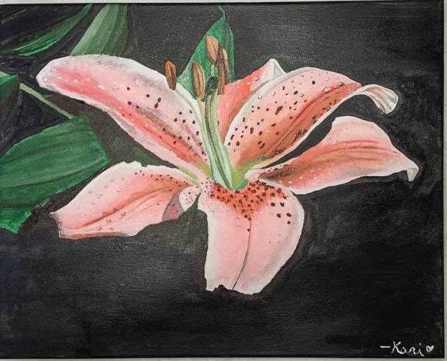
Now, yes, okay, I am the artist of this painting… but, I can tell you exactly where I applied different values on the canvas. Which, actually, is… basically everywhere.
Here are a couple of places you can look to easily see my intentional differentiation of values…
- Highlights of white along the edges of each of the pink petals
- Highlights of light green in touches on the green leaves to the left of the flower
- Lowlights of brown on the insides of a select few pink petals
- Lowlights of black in the background
Of course, there are really a million tiny highlights and lowlights all over within a painting, whether we place them there intentionally or not. So, aside from the short list I made above, you may find even more areas of different values if you stare at my painting long enough! Just don’t burn your eyes out from trying to mentally separated every single pigment of color for an hour and a half, okay?
And… Why Should We Care About Value?
Honestly, you don’t have to care about value at all, whether you’re an artist or not. However, if you want to improve yourself as an artist, it can be helpful to learn about the elements of art, like value, so you can experiment with them in future paintings. Because, as painters, we should always be ready to learn and try new things in our artwork—you never know what might come of it.
Since value is all about the highlights and lowlights of paintings, it’s super useful to pay attention to if you’d like to make realistic paintings. Think about all the values in color we see in real life—take a look away from your device right now and notice all the “highlights” and “lowlights” you may see in the room around you!
Paintings with minimal values typically look more two-dimensional, or flat. Which isn’t a bad thing, actually—abstract paintings ignore the element of value all the time and still look very eye-catching! For paintings with more depth and a three-dimensional quality to them, though, using value should be at the top of your mind.
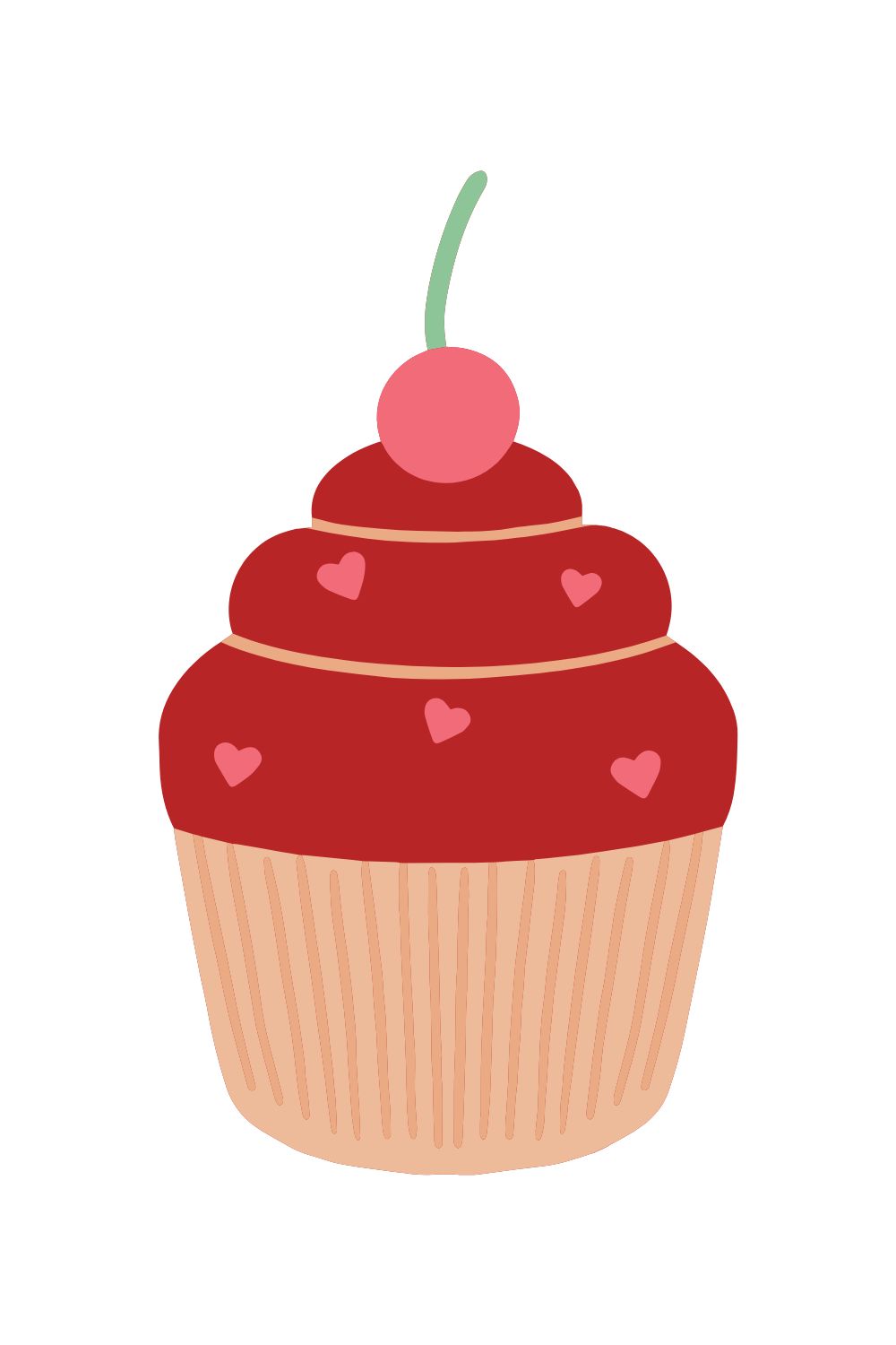
To demonstrate the different between a picture that does not use value and one that does, let’s do a little bit of a side-by-side. To the left, you’ll see a simple digital graphic of a cupcake that does not use any differences in value; to the right, you’ll see a real painting of a cupcake that adds highlights and lowlights for a more realistic effect.
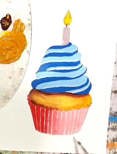
Again, I painted the image on the right myself, so I can tell you where to look to see all of the main variations in value, like…
- The white highlights on the “stripes” of blue frosting
- The light-to-dark look in the cupcake liner (it’s lighter pink toward the right and darker pink toward the left)
- The yellow highlights on the “cake” part
- The dark brown lowlights on the “cake” part, underneath the frosting and along the upper edges of the cupcake liner
Of course, there may still be more differences in value here to see, and there are probably areas where I could have added even more values as I was painting it. However, I actually painted this cupcake for one of my beginner-friendly online painting classes (pst, found here!), so I didn’t want to add too many complicated values for students to try and replicate.
Now… How Can We Practice Using Value?
Yeah, yeah, I know what you’re all thinking… “sure, value sounds like a great element and all, but how the heck do we actually go about using it?”
Don’t worry, I got you!
Frankly, the best way to practice using value in your paintings is to just try using value in your paintings. I know, simple but complex, right?
Here are some quick tips to get you started with using value, though…
- Try painting based on a reference photo taken from real life. Remember, values are everywhere in real life, so working off of a picture that is full of them is a good starting point.
- Spend time analyzing where the obvious highlights and lowlights are in real photos. You can use, literally, anything from your own baby photos to stock photos of landscapes online. Quiz yourself on where all of the “light” and “dark” variations of a given color are in each picture.
- When painting based on a reference photo, pay attention to just one area or specific color of the picture at a time. Don’t overwhelm yourself by worrying about incorporating every single highlight and lowlight all at once—just breathe and take it step by step.
- To physically create highlights in a painting, just add white paint to whatever color you are working with. Yes, it’s really that simple!
- To physically create lowlights within your paintings, you can add a “darkener” to whatever color you’re working with. While it’s not as straightforward as creating highlights with white paint, you can add black, raw umber, burnt umber, brown, or a color’s complement to the color you’re working with to make it darker. Just experiment with it before you start adding lowlights to your canvas because it can be tricky.
If you’re new to creating value in your paintings, it can be… well, quite overwhelming, and I get it. However, I’m here to help you learn this concept in the least stressful way possible!
So, I’d like to invite you to join me in this amazing, FREE paint blending workshop, in which we practice creating highlights in objects. We also briefly chat about value and how you can use it to make your paintings “pop”. Oh, and it comes with a printable workbook!
Plus, if you want to improve and practice even further, you can with even more of my online painting classes and courses. Because, like I said, practice is the best way to improve, and you deserve a chance to practice value, blending, and other painting techniques in a stress-free environment.
Check out all of the painting classes, including additional free classes and workshops.
Practice, practice, practice your paintings, and adding value to your artwork is going to become second nature—I promise.
Leave a comment below, too, if you have additional questions about value or any other elements of art!
–Kari

Pingback: 2 Ways to Add Highlights to Your Paintings – Kari Lynn M.
Pingback: 5 Methods for Adding Lowlights to Your Paintings – Kari Lynn M.
Pingback: Line, Shape & Form: 3 Key Elements to Your Paintings – Kari Lynn M.
Pingback: What Are “Still Life” Paintings: A Guide for Beginners – Kari Lynn M.
Pingback: How to Add Value to Your Paintings | Video on Creating Realistic Artwork for Beginners – Kari Lynn M.
Pingback: How You Can Become a Great Painter without “Natural Talent” – Kari Lynn M.