Welcome, fellow painter!
Let’s go over some quick and easy ways to add value to your paintings. Value is, of course, a lot of things in the world of art—but, here, we’re talking about value in terms of highlights and lowlights. Specifically, we’re going to cover highlights in this article.
Why Should I Add Highlights to My Artwork?
Now, before we break down our two main methods for creating highlights in your paintings, let’s actually dive into why you should use highlights in the first place. Because, hey, I wouldn’t want to use some random painting method if I didn’t know why it was important, either!
Mainly, highlights, along with lowlights, create value in a painting. And, I already mentioned this above, but value is essentially the perceived lightness or darkness of color on the page. And multiple layers of “lightness” and “darkness” in your paintings create depth, and depth creates realism.
Yeah, I realize that’s a lot to throw at you, but that’s just a very quick rundown on what value is. If you’d like to dive deeper, you can also read this article about value in paintings.
Defining and Finding Highlights
Now, when we look at a “realistic” painting (this doesn’t always apply to abstract work), we can usually (again, not always—but that’s the beauty of art!) see highlights in the work. These highlights are areas where the imagined “light” in the painting’s scene hit objects.
Take a look at this painting, and see if you can notice where the highlights intentionally are placed.

See the highlights? No? It’s all cool—they can be very tricky to see if you’re new to this!
In the rose painting above, some of the main highlights can be seen on each of the green petals—it’s just the lighter green areas. As for the rose itself, the highlights are really just all of the light pink and white-ish areas on the petals—and, yep, there’s a lot of them, so no need to count them, just take note of them.
The rose example above it actually a pretty simple picture, too. In more detailed, complex paintings, there can be hundreds of tiny highlights scattered all over. Just take a look at the landscape painting below and see if you can just pick out a few of the many highlights there. Remember—highlights are the noticeably lighter areas of a painting.
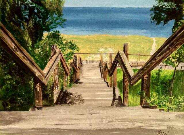
And, actually… okay, you caught me, I’m actually the artist of this painting. But, that means I can tell you exactly where I intentionally placed all of the hundreds of tiny highlights in the piece!
My main focus, when creating this painting, was to place most of my highlights on the boardwalk area—on all those wooden steps you see leading downward. I also put a lot of effort into making highlights on the wooden railings. Other areas where you may see some highlights include those subtle light areas in the grassy sand and in the water in the upper half of the picture.
I also really focused on recreating this scene from a real photograph, which really helped me determine where all of my highlights should be placed. And there’s a reason for this…
Highlights and Realism
Highlights are found in real life. So, paintings that utilize highlights will reflect realism.
Now, we could really go on and on and on about how to make your paintings appear as true to life as possible, but, again, we’re just focusing on making highlights here, so think of how light works in real life.
In real life, UV light (from the sun, a lightbulb, or whatever else you can find that emits visual light) always hits objects from the angle it is projected from. And, the places where light “touches” objects is what creates highlights.
Let’s take a look at this idea in a real photograph. Here’s a snapshot I took a while back of my pal Bella with a book I was reading. This photo shows some really obvious highlights on my dog, lighting up her white fur—see if you can tell which direction the light is coming from in the photo!

Could you guess the direction of the room’s light? I’ll give you another moment…
Alright, got it yet?
The light is very distinctly coming from the right side of the photo, and we can tell because the right side of Bella’s face and body is highlighted. You can also see some bright highlights on the right side of the book, along the white pages.
Now, we are only focusing on highlights here, but here’s another quick hint for future reference: lowlights usually sit opposite of highlights. So, while light can hit an object (like my pup up above) on one side, a shadow, or lowlight, will probably be cast on the other side (note her shadow on the blanket in the photo, too).
Highlight Method 1: White Paint
Perhaps the most common (and, maybe, easiest) method for adding highlights to a painting is by simply adding white paint to create the look of light on the page. And this method can be used with both acrylic and watercolor paints, although it’s most commonly used with acrylics.
However, there are really two ways of implementing this method, so let’s go over them one by one.
Mixing White with a Color
For beginners, the easiest way to add highlights to a painting is by mixing your highlight colors on your palette prior to applying them to the page (or canvas). This lets you preview the tone of your highlight before you incorporate it into your painting, making it a lot less likely for mistakes to come up (although we always welcome happy little mistakes as artists… don’t we?).
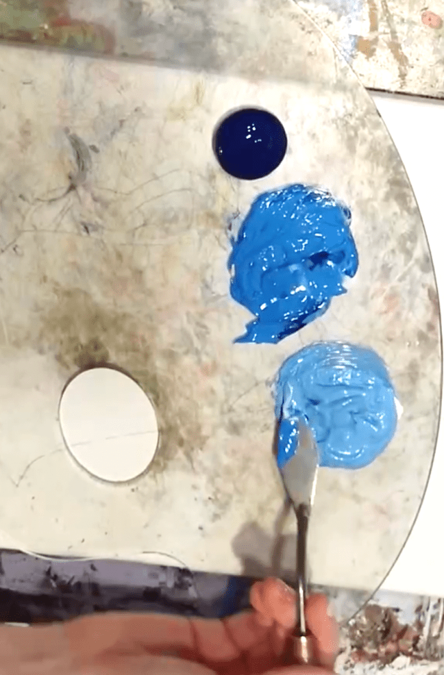
To try this, you’ll need to mix any color you’re using with a bit of white on your painting palette. White is a “lightener”, if you will, so it’ll always make any color lighter as you mix it.
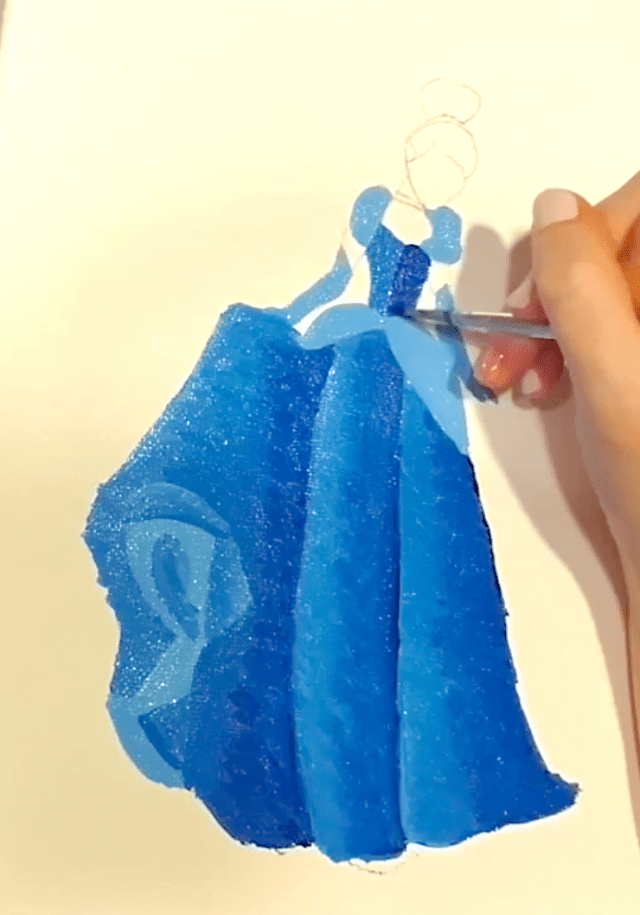
Here’s a snapshot of this method in action. This is taken from my Cinderella painting class on Canvas Academy, and you’ll first see my painting palette with two different highlighted tones of blue being mixed with white before painting. After that, you can see my brush putting those lighter blues into Cinderella’s dress for the highlighted effect.
You can try this method with more complex paintings, too. Just mix a lighter version of each color you will be using in your painting on your palette. While painting, dip into those lighter tones as needed to make lighter areas of color on your canvas.
Directly Applying White
Another way to add highlights to your work is by painting with white paint directly on your page or canvas. This can be tricky to master, though, so give yourself grace as you practice it!
Now, when we directly apply white paint to the page, we don’t just drop it on the page and call it a day. Instead, you’ll want to blend the white paint with the paint underneath it that’s already there—this makes for a nice, smooth finish. In some cases, though, we might need a super white highlight, and then it’s okay to skip the blending… but, typically, you’ll need to incorporate some blending.
Check out an example of this method in action below. This is taken from my online “Stack O’Melons” painting class, and you’ll first see a “before” image of a watermelon slice without any highlights added to it. After that, you’ll see a snapshot of my brush, with plain white paint on it, blending out some nice highlights along the upper-left curves of the watermelon slice.


This method is a nice time-saving method because it eliminates the need to mix your highlight colors before you apply them to the canvas. Instead, we “mix” our highlights up right on the canvas by blending that white paint where we want to see the light shine through.
Highlight Method 2: Water
Another way to get some nice highlights in your paintings is by adding water, instead of white paint, to the areas where you want to project light in your pictures. This method, again, can be used with both acrylic and watercolor paints, but it’s more commonly used for watercolor painting.
The reason that this method works is because water dilutes paint, making it more translucent on the page. And, assuming you’re painting on a white page/canvas, that means that the whites of the page/canvas will show through your colors, making them appear lighter.
Now, as you try this method, keep in mind that the water on the end of your brush is going to mix and blend with the colors on the page as you paint with that water. We want that—it’s just like blending with white paint on the page!
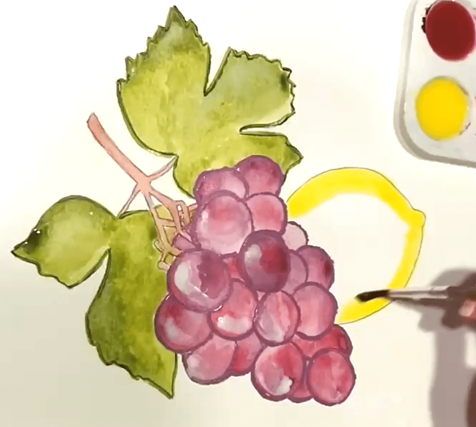
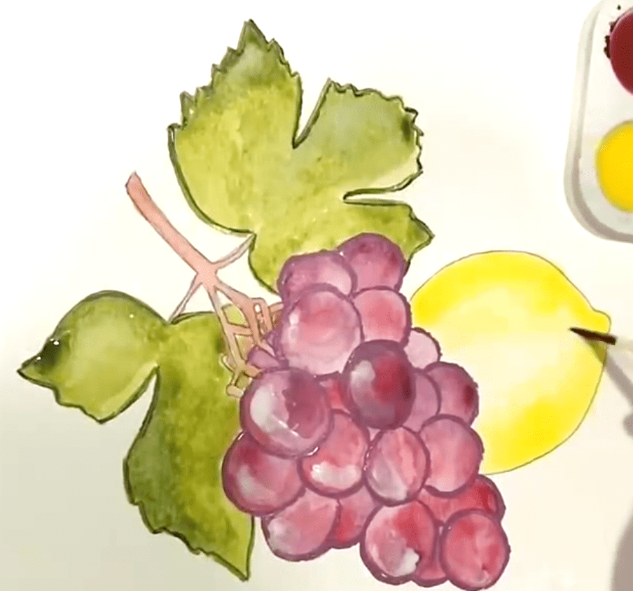
Here’s an example of this method in action, using snapshots from my “Lemony Grape-It!” online watercolor painting class. First, you’ll see a lemon with some dark yellow watercolor lining its edges. Then, you’ll see my brush filling the lemon in with plain water—but notice how the water blends with the yellow already on the page to make an even lighter yellow in the middle of the lemon.
Now, I get it—chatting about highlights is a lot different that physically making highlights in your paintings. But, I want to keep helping you on your painting journey—and I’m here to assist you in practicing the whole “highlight” concept!
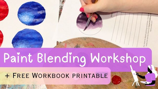
That’s why I’m offering this totally free online painting workshop that’s focused on creating highlights, working on blending technique, and learning about value. There’s even a free workbook printable attached with the guided workshop video. It’s a lot all in one class, so check it out!
And, if you’d like to go even deeper into learning about painting techniques, check out this full “basics” painting course! It’s got tons of classes, printable workbooks, and more—all designed to help you become the best artist you can be.
Stay tuned, fellow painters, for more painting tips and tricks, too, here on the blog!
–Kari


Pingback: 5 Methods for Adding Lowlights to Your Paintings – Kari Lynn M.
Pingback: How to Master Flowers with Acrylic Paint – Kari Lynn M.
Pingback: How to Paint Realistic Fruits & Still-Life Pictures – Kari Lynn M.