Hey guys! So, today I wanted to share another mini art tutorial with y’all that I did for a class a few months ago. Like I did last week, I just want to add some artsy posts to my blog here, and I wanna try a few different ones and see what you all like best (for example—photo based, video based, or text based?). And so, this week, I have a picture-heavy post created to show you all how to mix paint colors!
Enjoy!
What will I need?
This might just blow your mind, but nearly every painting can be created from just 6 tubes of paint! 6 colors—primary red, primary yellow, primary blue, raw umber, burnt umber, and plain white—that’s seriously all you need!
I use acrylics, and this is what I recommend for beginners, but you can mix watercolor, tempera, and oil paints very similarly.

You can find these colors labeled just like this or very similarly at the store where you get your supplies. Raw umber and burnt umber are usually named just that, but sometimes white is also called “titanium” white. Blue, red, and yellow also come in a few different variations; it’s best to find ones labeled “primary” blue, red, or yellow, but those labeled “cadmium” or “med” also work well.
Note: blue especially comes in many different shades. “Cobalt” blue and “ultramarine” blue are different from the primary blue, but you can get these in addition to that primary to experiment with!
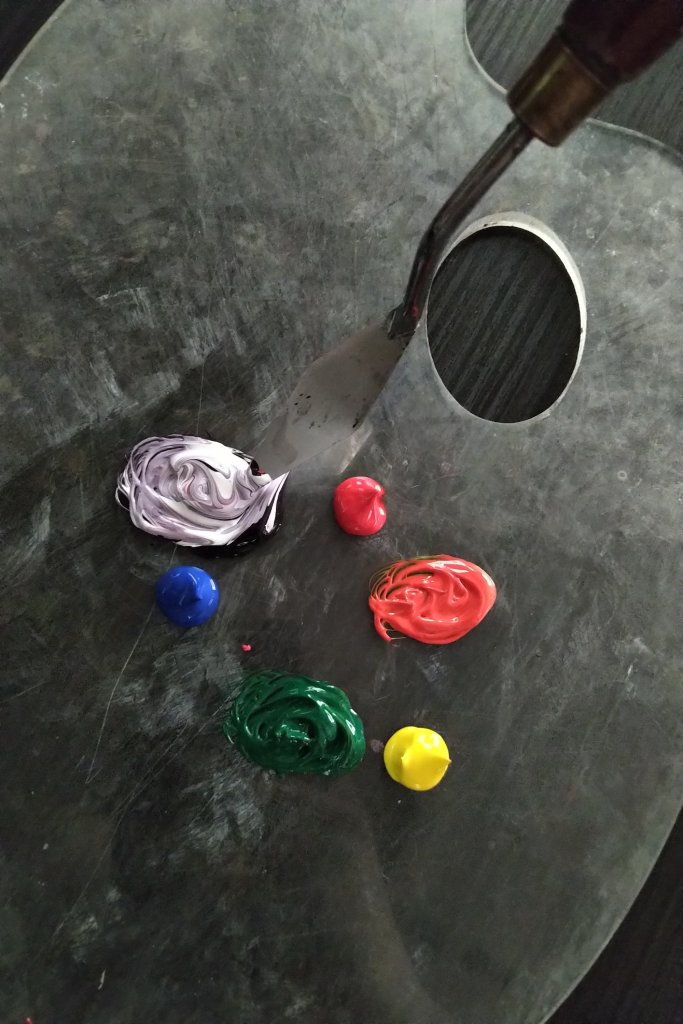
You will also need something to mix on and something to mix with as well as something to clean with (a paper towel or napkin). As you’ll see in the rest of my pictures, I use an artist palettes and a palette knife for mixing, but when I first started out I just used a paper plate and a butter knife!
What do I do?
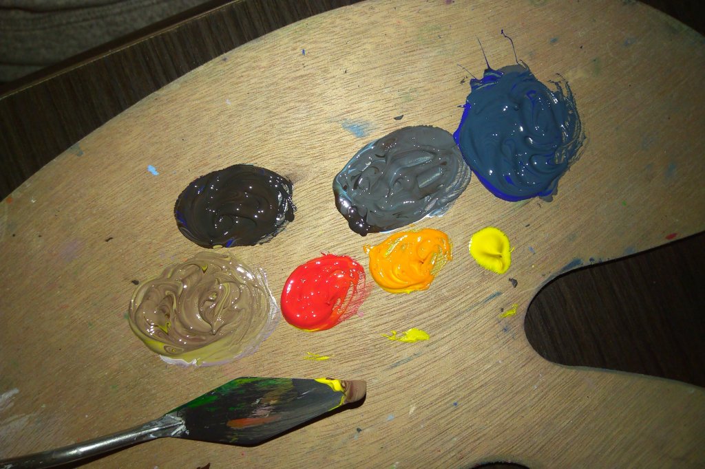
Make a color wheel
The best way to get acquainted with the main colors is by mixing them all for yourself at once, in a color wheel.
- Squirt out a dab of each of your primaries on your palette (or makeshift palette!)—red, yellow, and blue.

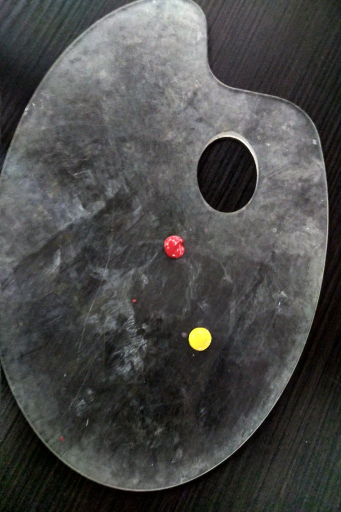
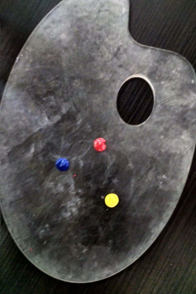
In the world of art, these are the 3 primary colors. They’re called primary because they are the first colors we use in mixing; they cannot themselves be mixed from anything else.
- Add a second dab of each color on both sides of the first dab.
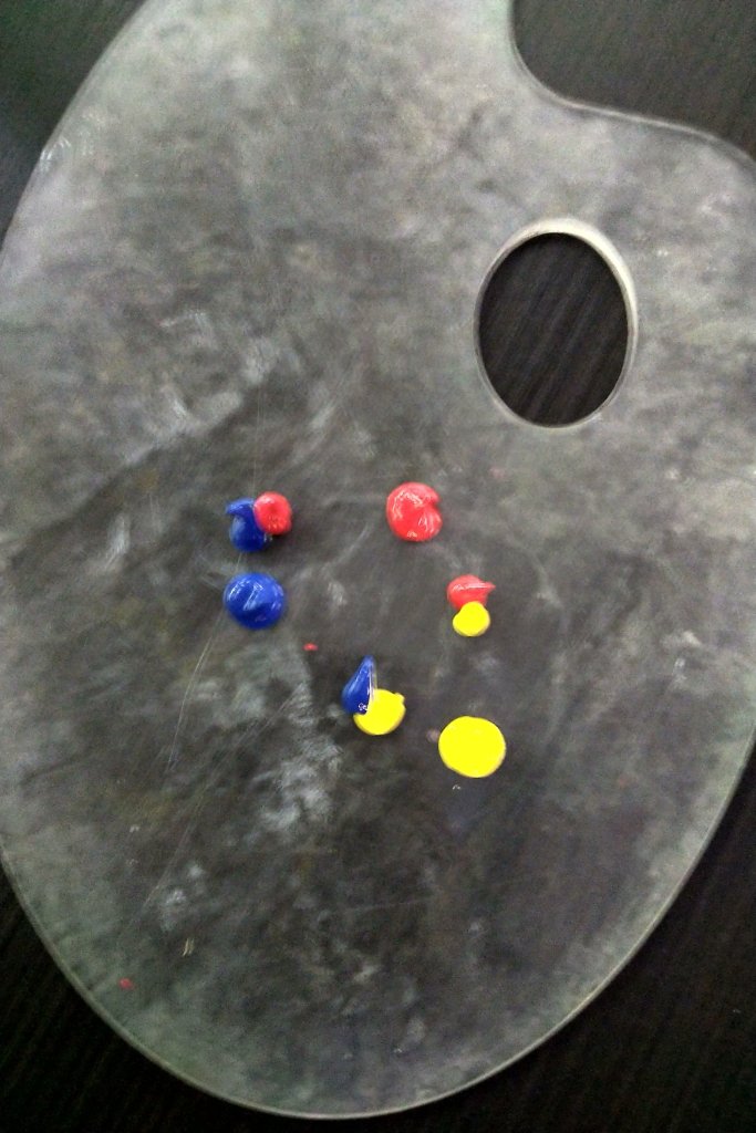
- Take your palette (or butter) knife and swirl the tip of it in each of your secondary dabs. Be sure to always wipe your knife in between each mixing.
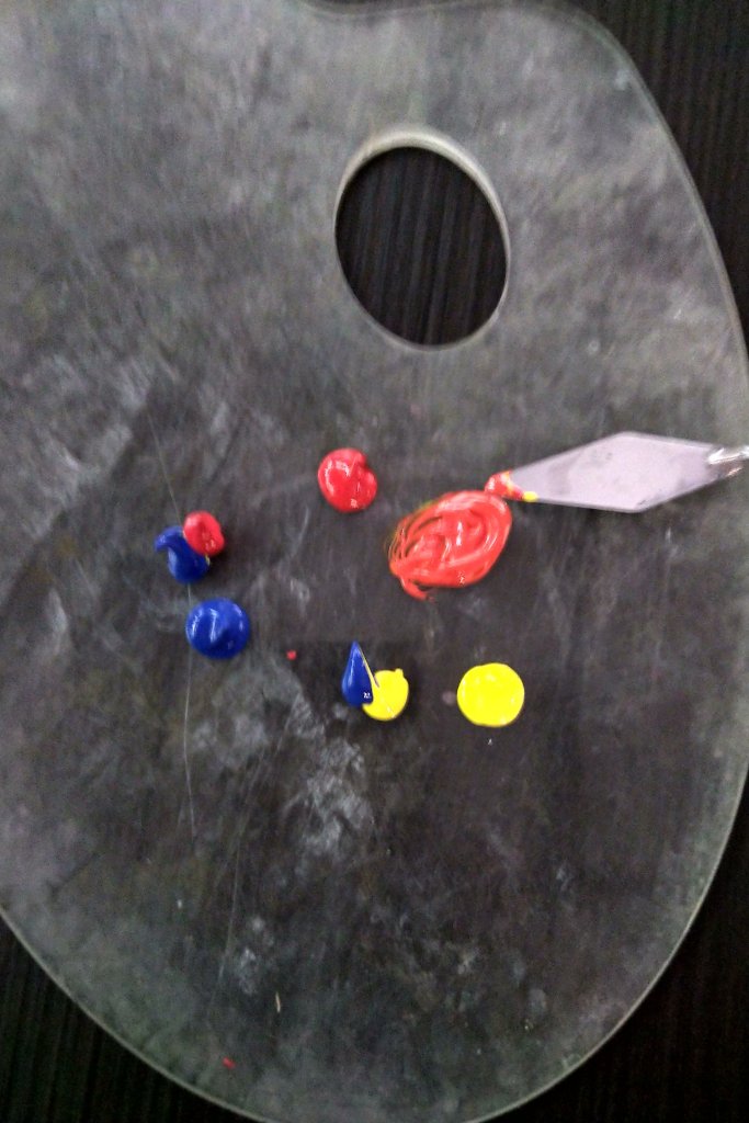


You’ve just created 3 secondary colors—orange, green, and violet! These are fittingly called secondary because each are made from two primaries and come second in the making of the color wheel.
However, that violet (or purple) can appear very dark at first and is tricky to work with at this stage. It looks more like black right now, doesn’t it? Let’s fix that.
- Squirt some white on top of your violet and swirl it up again!

Of course, you can add white to any color you want to make it lighter! Whenever you do this, you are making a tint of a color—that is, a lighter version of that color. In this case, we just made a tint of violet.
- Squirt out two more dabs of each primary on the outside of your wheel. Then, using the tip of your knife, scoop up a small bit of each secondary (remember—orange, green, and violet) and add a dab of those to each new squirt. Swirl these up, too!
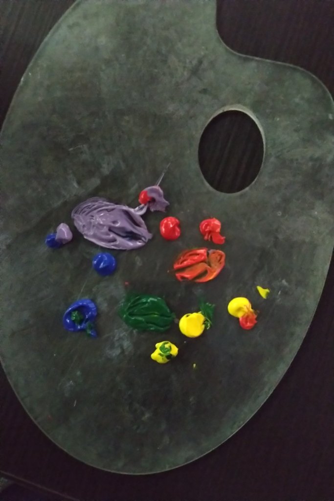
You just made 6 tertiary (also known as intermediate) colors! These are red-orange, yellow-orange, yellow-green, blue-green, blue-violet, and red-violet. They’re called tertiary because they’re mixed with three colors (one color twice) and come third in the wheel.
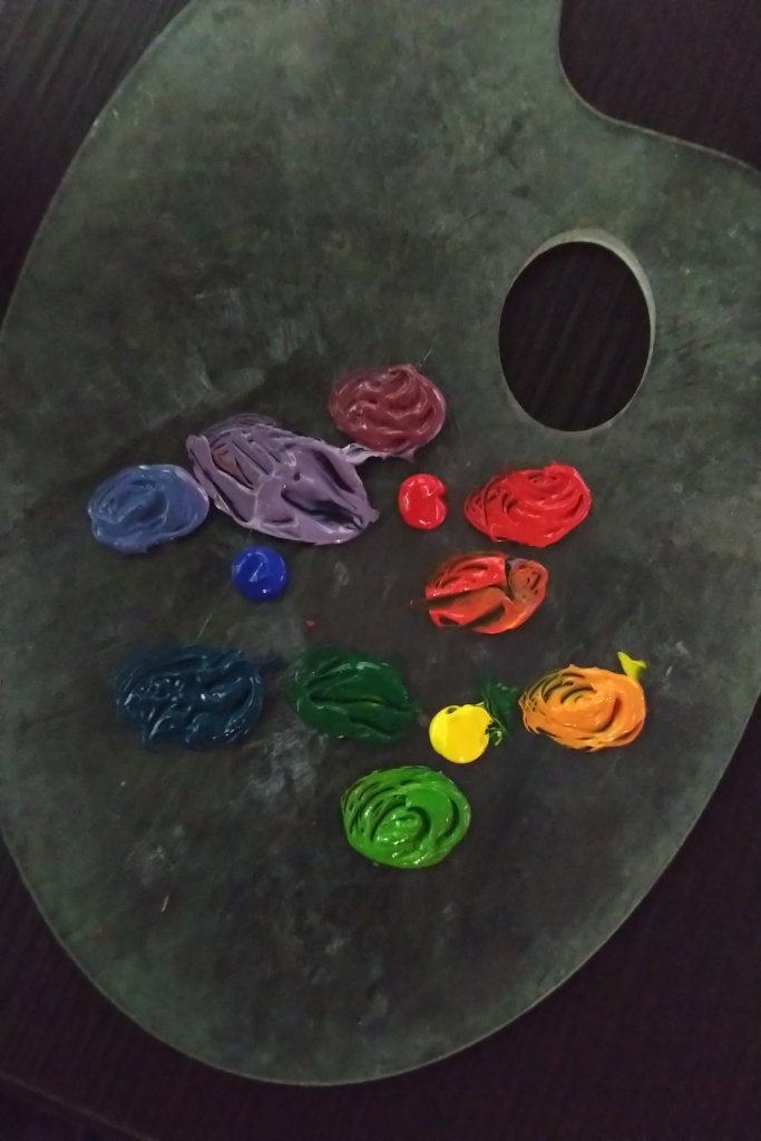
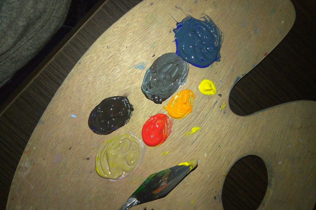
Chart the umbers
We just made a color wheel, but that was just for our main colors. Now, we need to understand how to get more tints (lighter versions) and shades (darker versions) of those colors
- Add two dabs of white on one end of your “chart” and a dab each of raw umber and burnt umber on the other end.
- Add another dab of white in the middle of your chart as well as another dab of raw umber (on one side) and burnt umber (on the other). Mix them up!
Note: in my photo example, I made two middle sections instead of one to show you the the range of tints and shades you could get.

Notice how raw umber becomes gray when added to white, while burnt umber becomes brown/pink-ish. Raw umber has blue undertones, which makes it a cooler color, while burnt umber has red undertones, which makes it a warmer color. So, to make a tint of any color, you can always add white, but making a shade is a bit more complicated. Blue colors always shade well with raw umber, and red colors always shade well with burnt umber, but yellow can go either way. Of course, raw umber and burnt umber can also be used by themselves, too.
Use colors in practice!
Now that we understand how to mix and get the colors we want, we need to figure out how to apply them to our own paintings.
For this section, let’s pretend I’m planning to paint my own version of this picture.

How am I going to recreate these colors? How can you recreate the colors in your own paintings?
- Look at the photo closely. Pick out the colors that pop out for you.
For my example, I see some yellow, orange, red, and shade of burnt umber in the sky. I also see black, blue-gray, and dark blue in the water.
- Use your color wheel knowledge and mix up what you think matches what you see.
Here’s how I would mix my colors to match the ones I see.

Note: raw umber acts as a light black by itself, but you can make it even darker by adding a little bit of blue to it.
- Look again. Did you match everything perfectly?
If you did, great, you’re ready to start painting! But, if not…
- Revise your colors. Add in something else to them and experiment.
I didn’t really like how the tint of burnt umber (bottom right on my palette) looked after my first mix. So, I added some more yellow to it to match that dark color I saw in my photo’s sky.
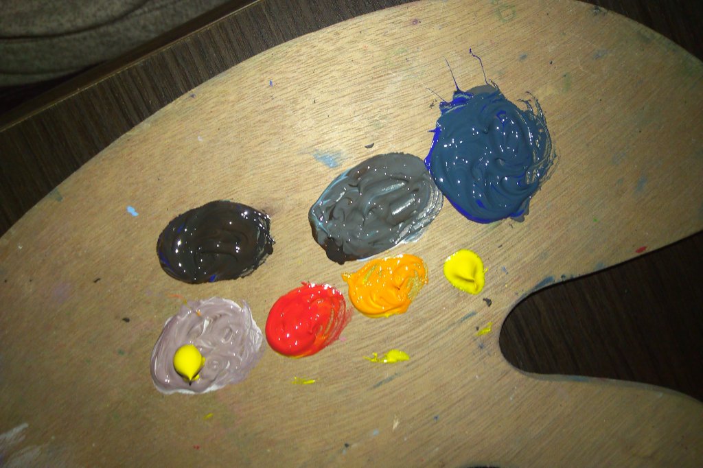
But, then I thought the color was too yellow and light; it needed something else. I could have either tried to darken it with raw umber or burnt umber, but I chose burnt to match the warmth of that orange sky.

There, that looks more like what I see!
Note: you can always revise your colors as you’re painting or mix colors right on your canvas. That may sound daunting at first, but the more room you give yourself to experiment, the more comfortable you’ll get with it!
Now, you should have a pretty good grasp on how to mix colors! Use what you know now of the color wheel and umber charts to practice on your own, and don’t be afraid to experiment and have fun with it!
Let me know what you guys thought/think of my tutorial!
–Kari
